ENGIE Australia
Digital Rebrand
Creating a world class digital experience for the world’s number one energy dealer.
ENGIE AUSTRALIA
HARDHAT, 2023
PROJECT DESIGN LEAD
ART DIRECTION
DESIGN SYSTEM
UI/UX
ILLUSTRATION
BACKGROUND
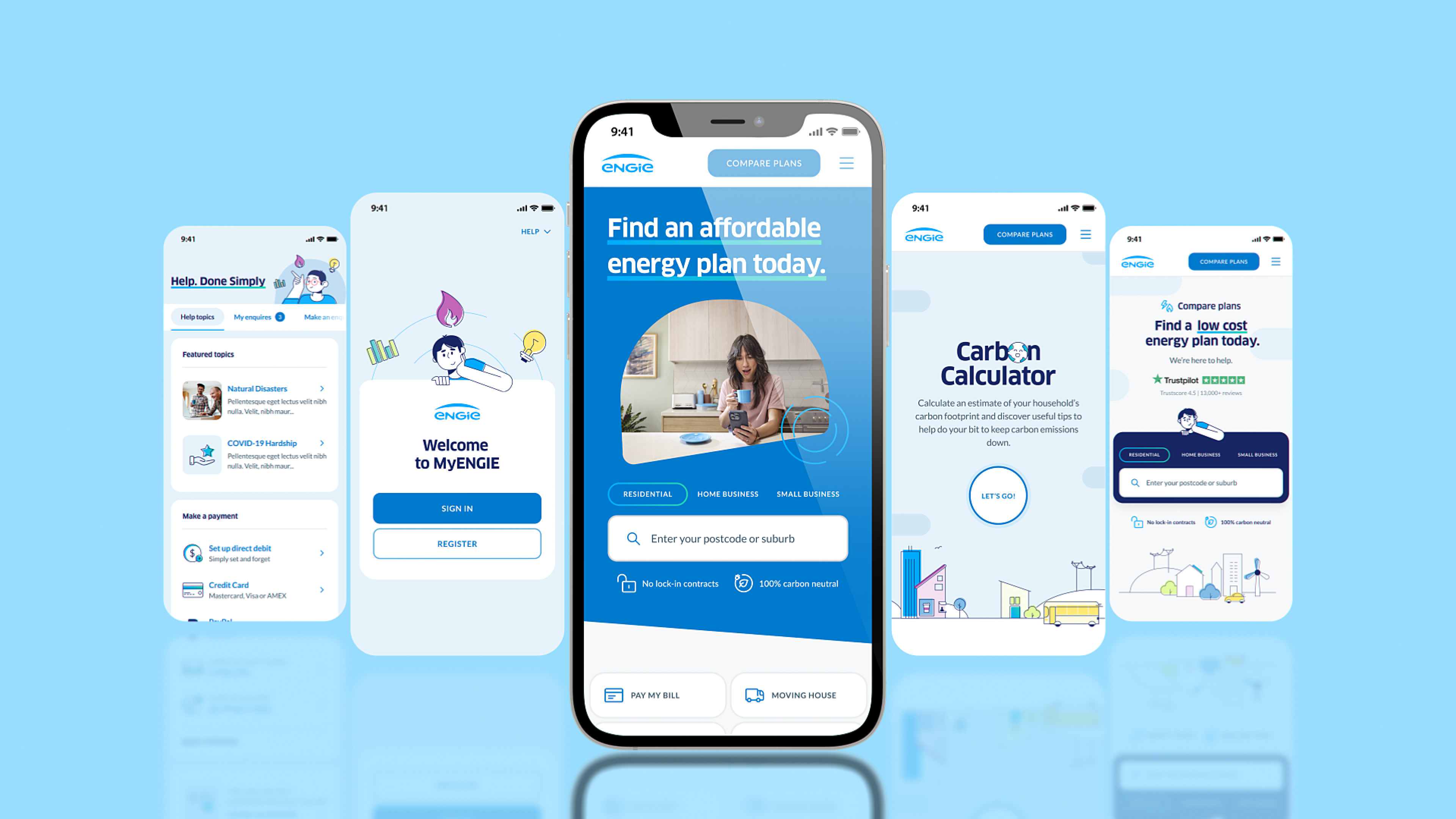
In April 2024 Simply Energy, one of Australia’s most popular and cost-competitive energy providers transitioned to ENGIE, a global leader in sustainable energy that operates in 31 countries across five continents.
This triggered the need to amalgamate two very distinct brand ecosystems containing websites and customer apps, into a singular, freshly positioned, Australian brand without losing either brands equity.
Preceded by years of business relationships and conversation, this merger had attracted widespread interest from nearly all stakeholder groups from the respective businesses, each with conflicting interests and motivations (not exactly a small audience).
PROBLEM
Simply Energy's core positioning is being ‘Australia’s most valued low-rate energy supplier’, whilst ENGIE's brand mission is to remain number one in the world for energy sustainability.
The ask was to introduce ENGIE's mission, to Simply Energy’s core positioning whilst creating one unified digital ecosystem that retained the 400,000+ home and business customer base.
CHALLENGES
1. Redesign, rebuild, and re-optimise every brand touchpoint for Simply Energy’s digital landscape in a condensed 9 month timeline.
2. Build a powerfully simple and scalable design system, compatible with advanced accessibility criteria demanded by the leading global brand of ENGIE.
A challenge in both scale and concept.
PROJECT
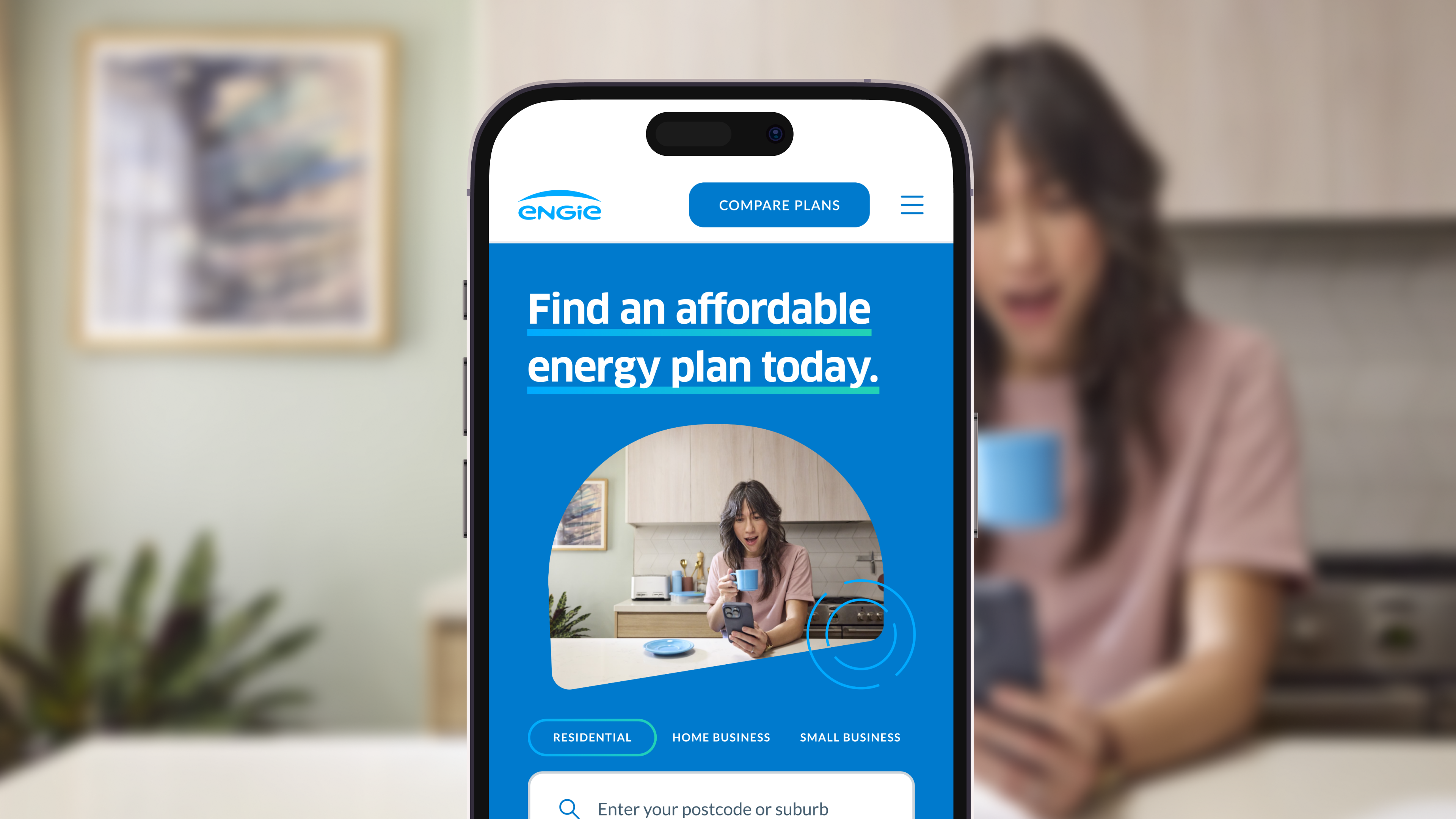
The project had four main phases: visionary, design system setup, UX/UI and development. We begun by envisioning what a localised ENGIE would look like - a brand able to successfully offer both a sustainable mission and low-cost offering. Taking direction and cues from the Australian market we were able to outline brand lynchpins that supported the simplicity and functionality within the Simply Energy brand. These were then energised through the introduction of the ENGIE global brand guidelines.
We then constructed a robust and scalable ENGIE design system, capable of applying our new art direction, across hundreds of existing Simply Energy designs. As customer retention was paramount all design updates had to maintain the rigorous CRO employed by Simply Energy. We took an approach of ‘optimising whilst preserving’ as we set to work.
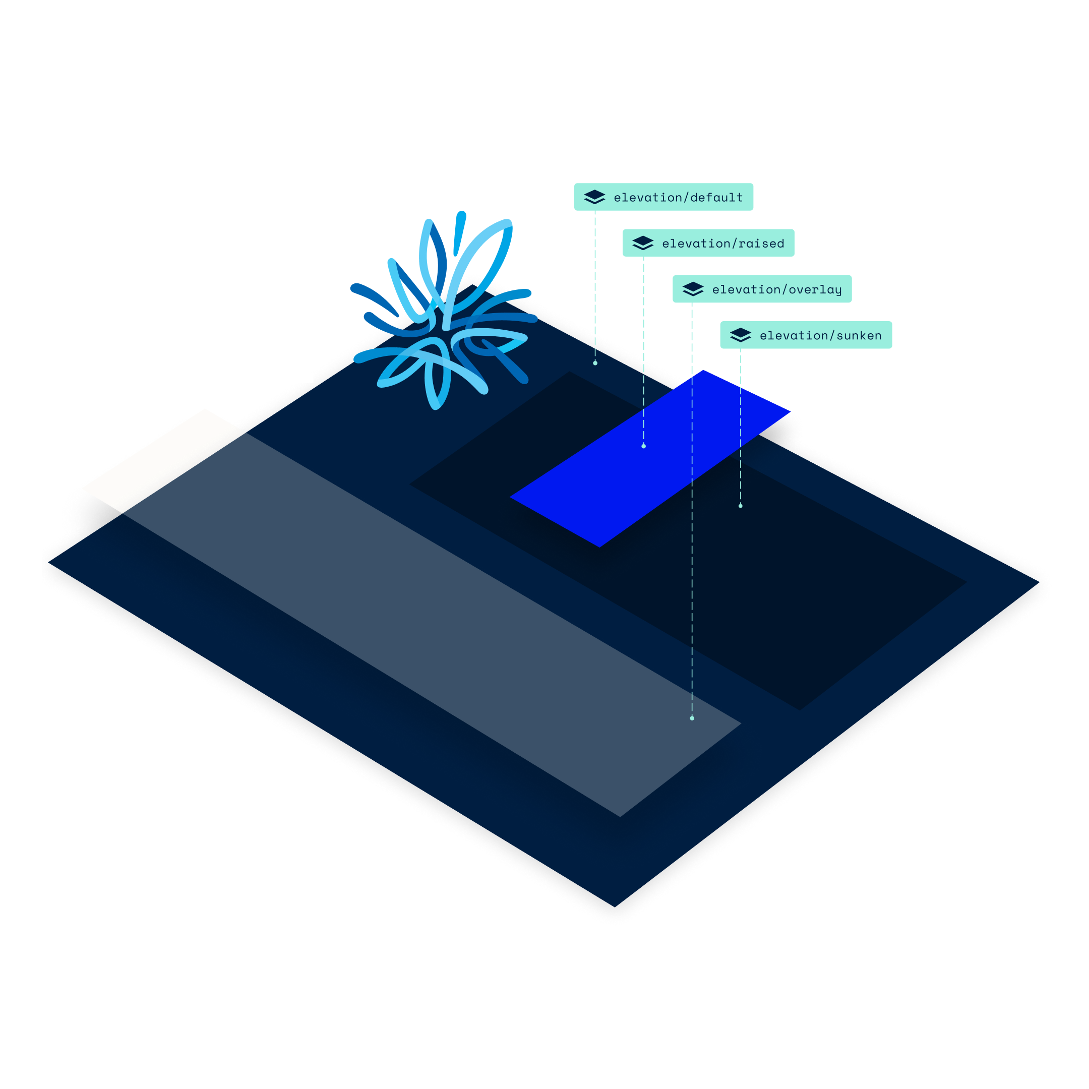
Working with the family of design systems previously built we leant on our technical knowledge of Figma and design system methodologies, to ultimately re-work the entire digital ecosystem without needing to design more than a handful of key screens from scratch. Once we updated our styles and master components using a 1:1 approach, the master and product design systems flowed through into hundreds of Simply Energy design files ultimately updating each customer flow with the new ENGIE look and feel while maximising efficiencies.
APPROACH
This required an in-depth and detailed understanding of both design systems methodology and Figma capability.
LEARNINGS
This project not only allowed me to personally better understand and apply the full capabilities of Figma, but gather, inspire and motivate a large team of designers to efficiently work together under a demanding timeline toward a clearly defined team goal.
My role as design lead meant I was responsible for a team of 17 designers, located across five major cities, working in three different time zones. Each product design system had a designated lead designer working in collaboration with myself to approve the pushing and pulling of updates. We democratised the decision making process whilst instilling core values and guardrails to our approach. The trust and respect manifested within the team allowed us to move at a motivated pace, achieving efficiencies and output far beyond the expectations of our teams size.
We ran the project with an agile Kanban board method utilising daily team stand ups, weekly client WIPs and running to a fortnightly sprint cadence. I led and presented 15 client showcases, facilitated 10 development handovers and initiated an unofficial twice weekly design review solely for the design team.
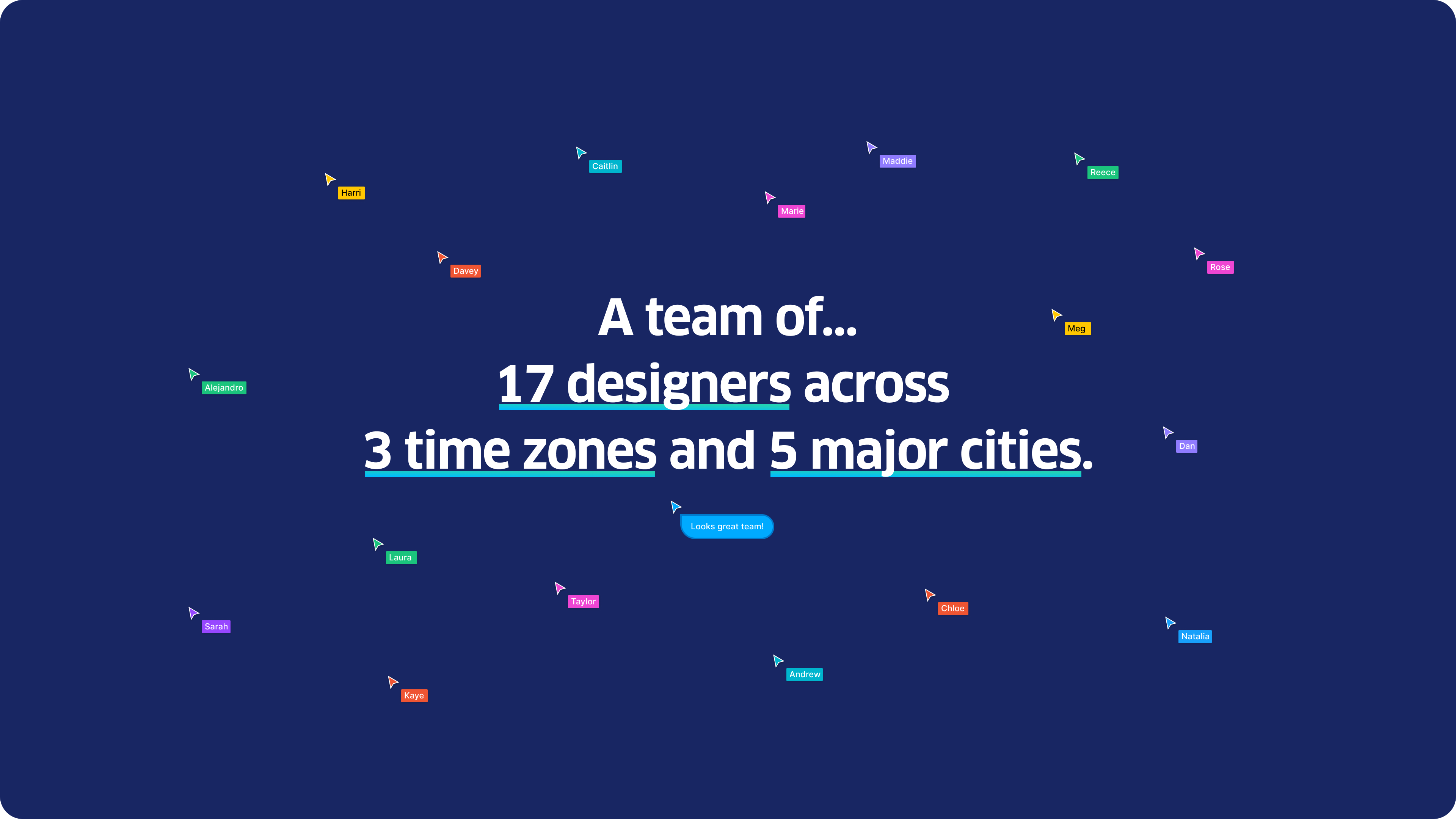

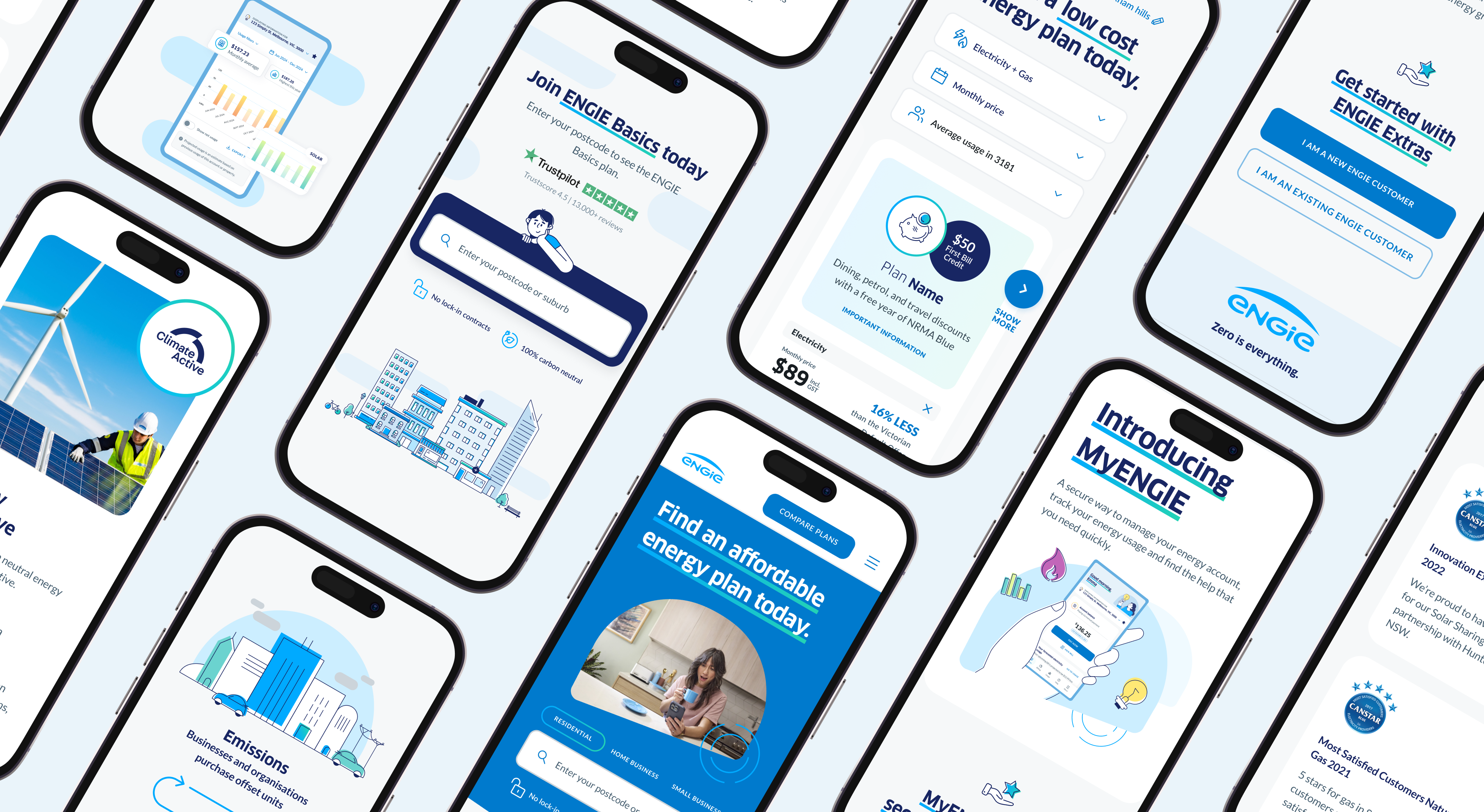
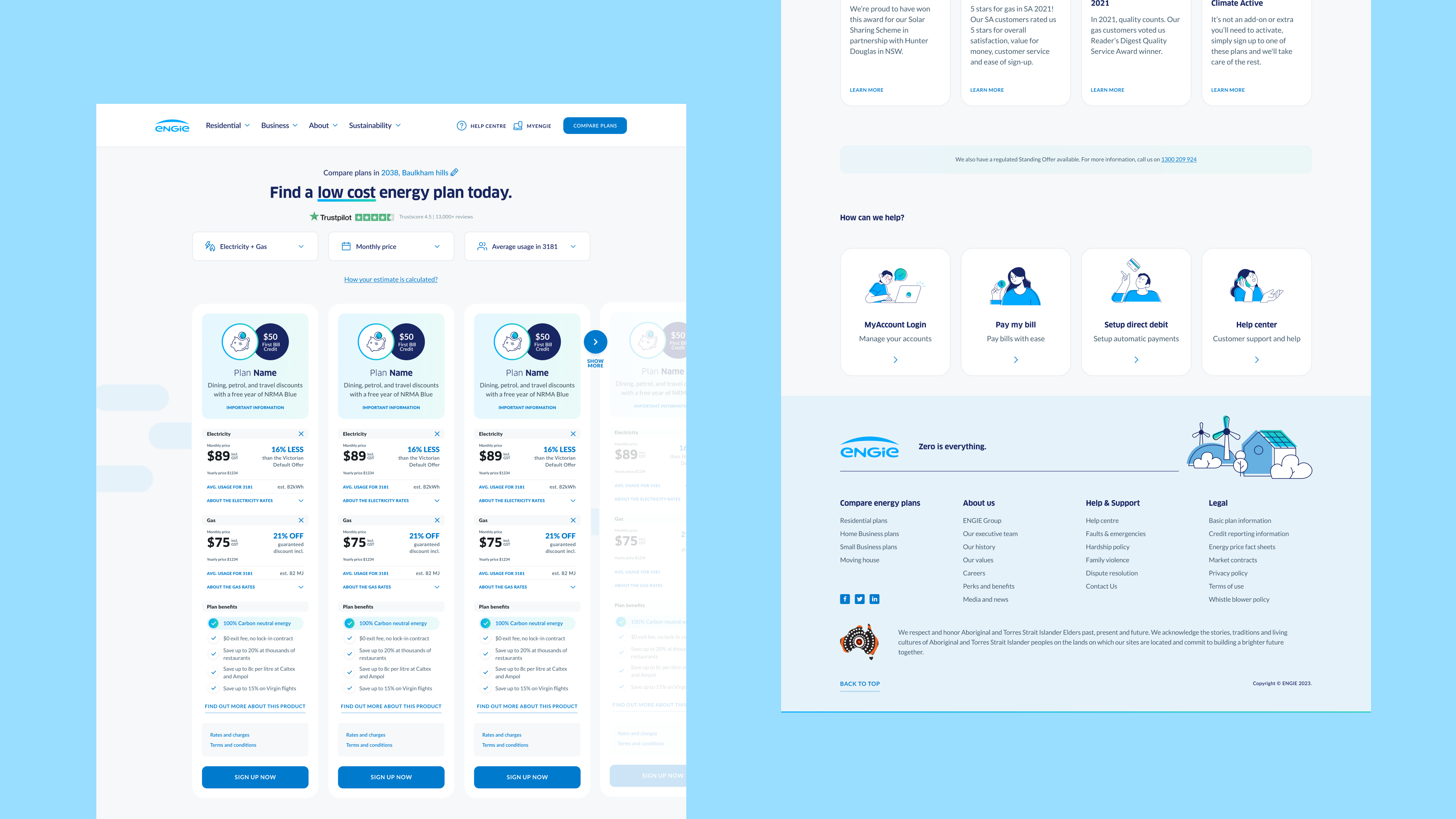
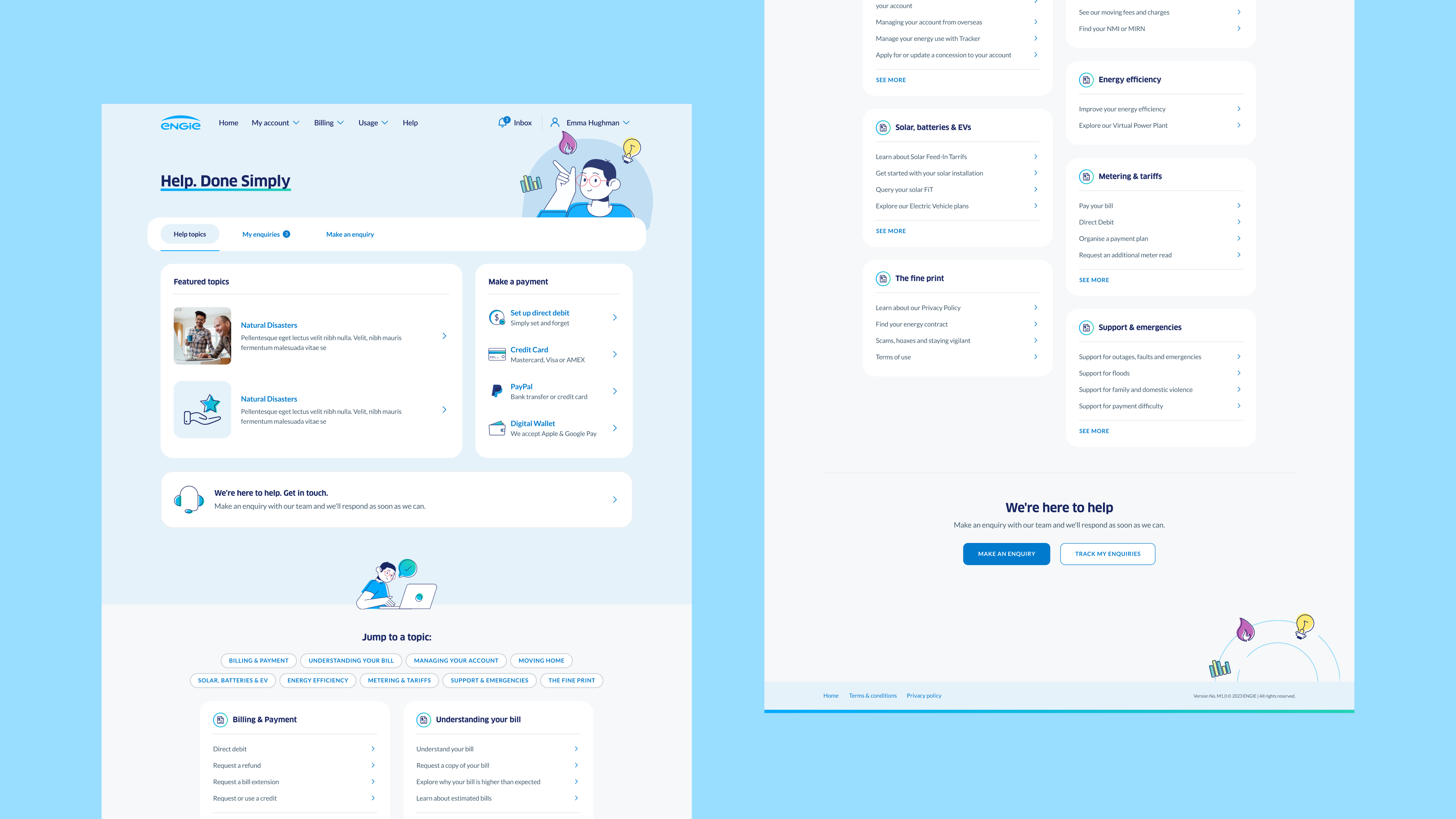
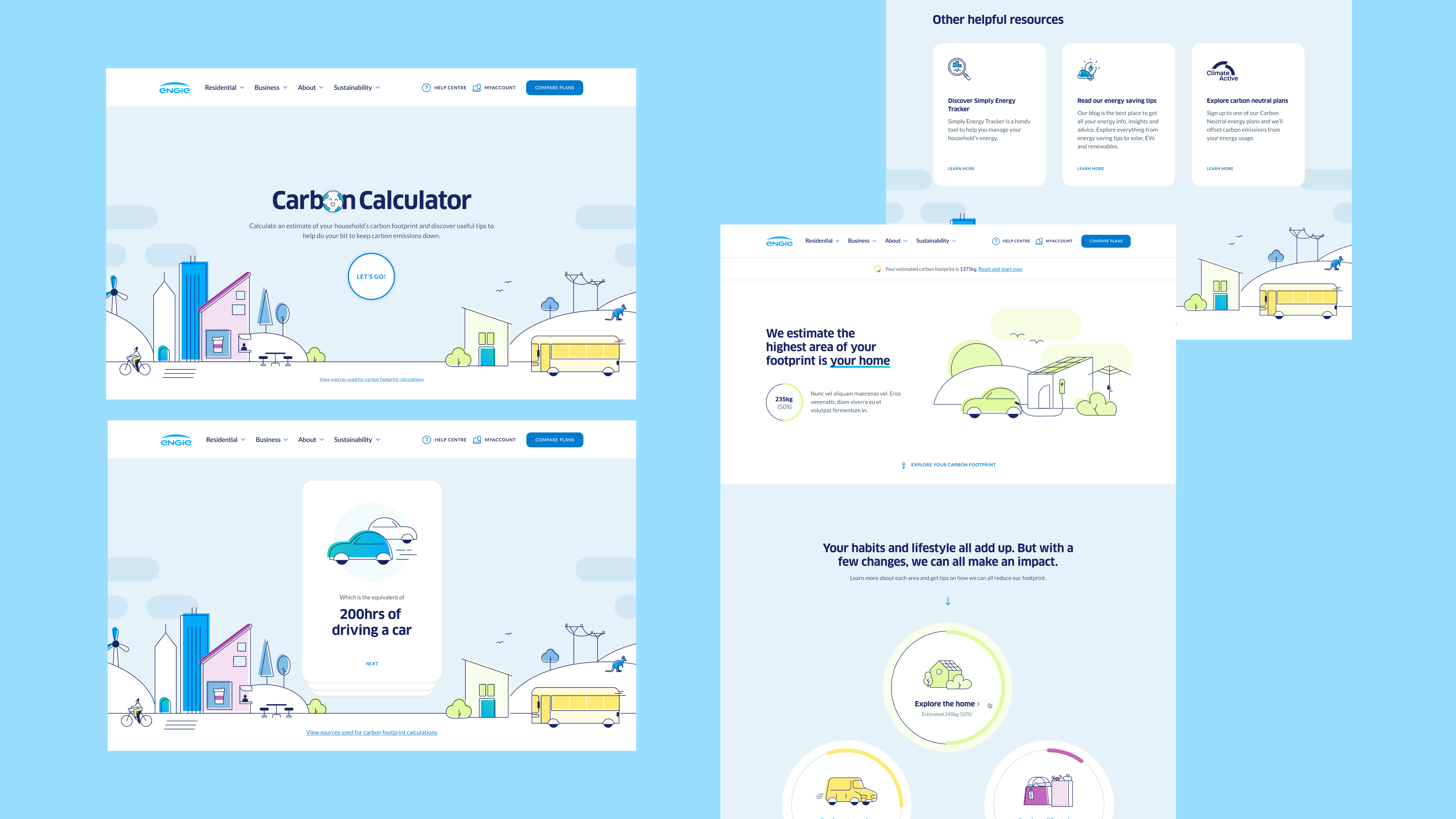
ILLUSTRATION LIBRARY
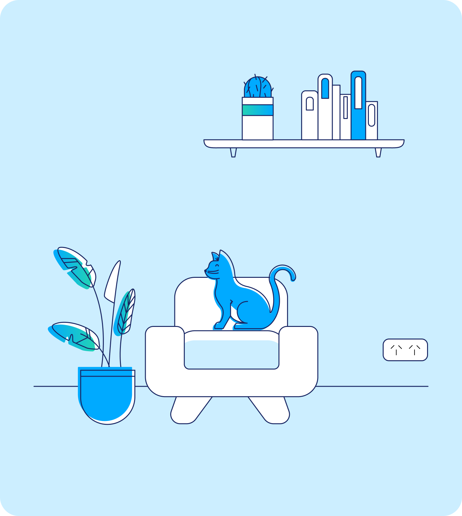
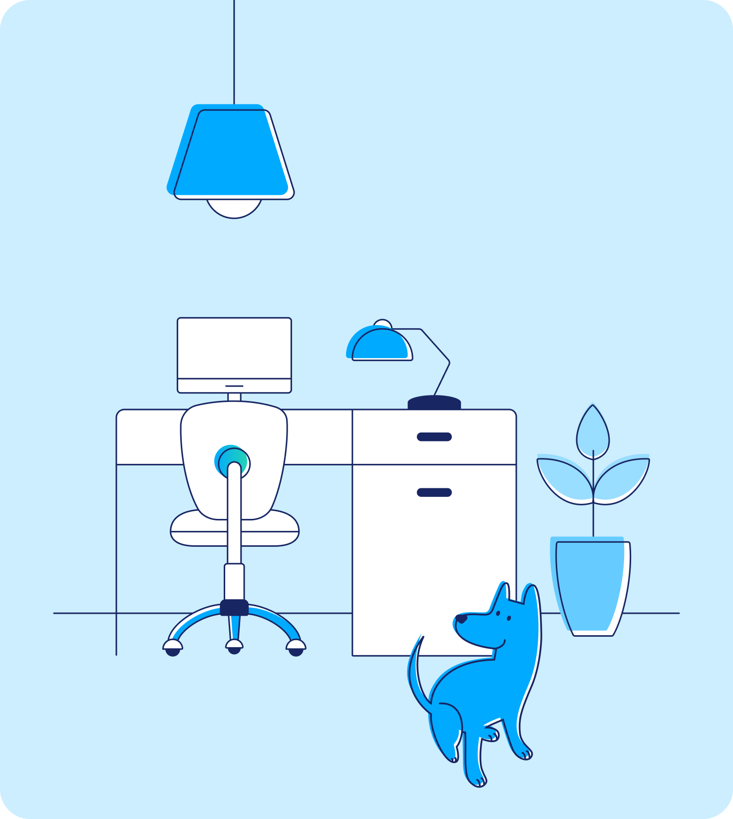
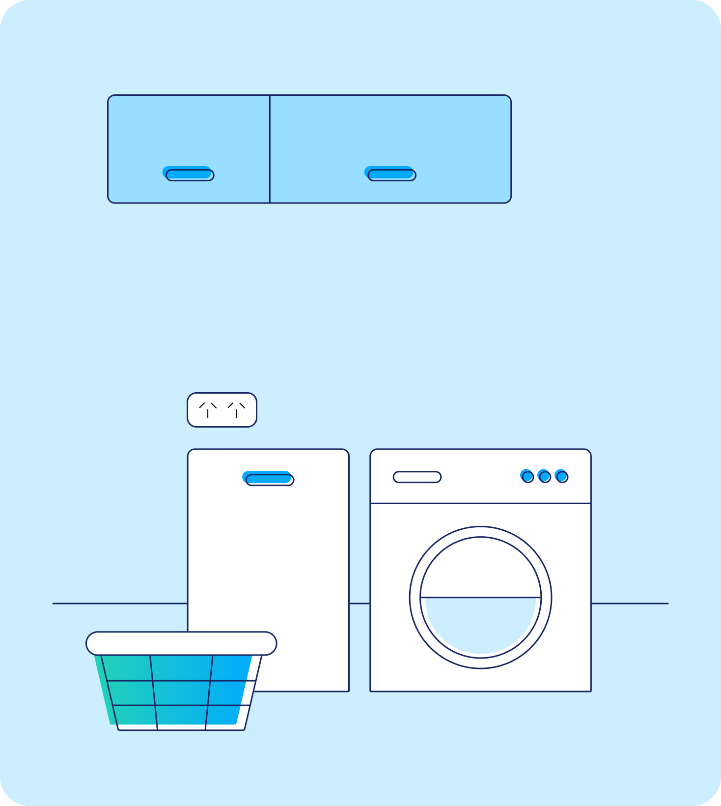
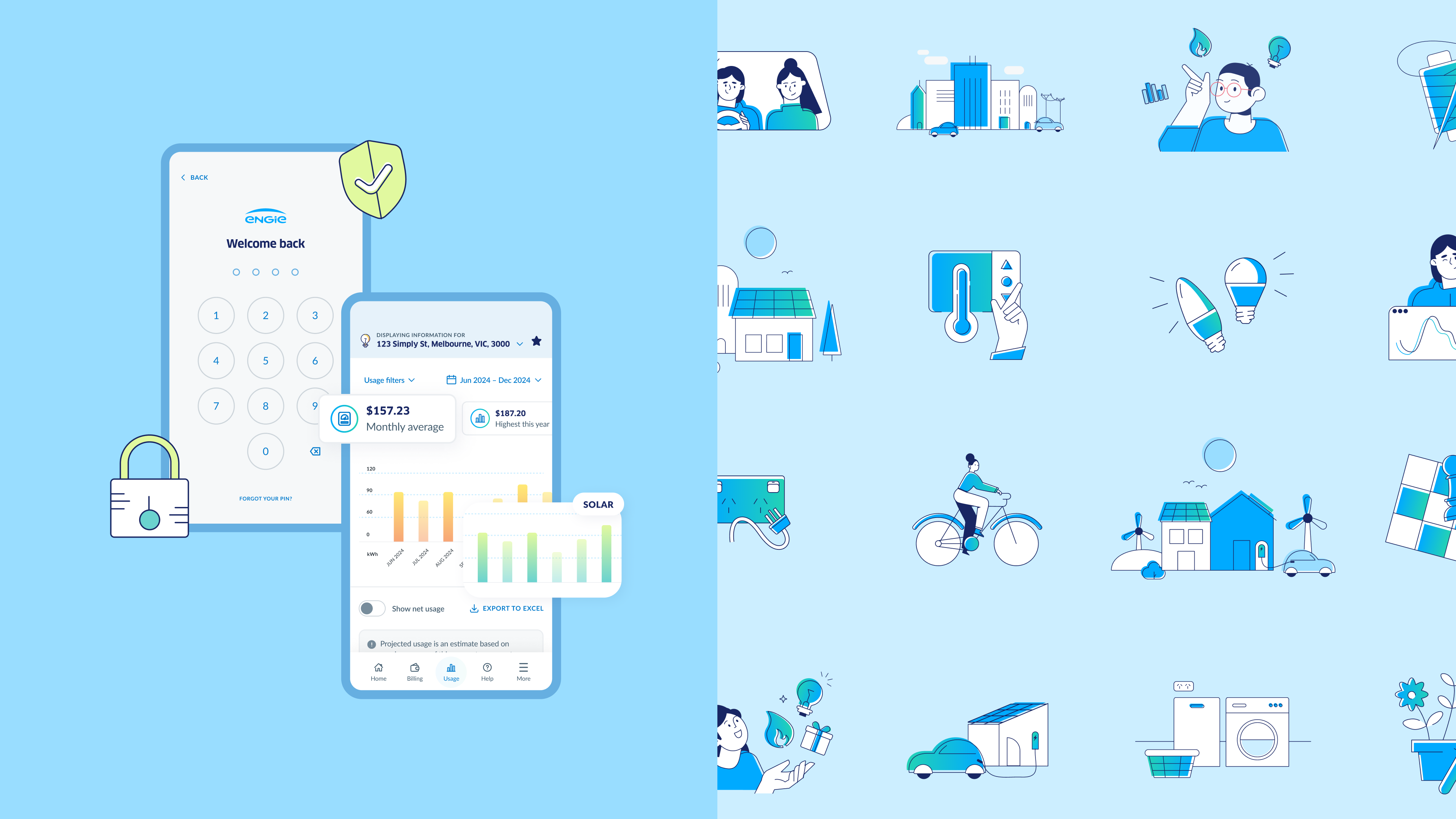
From sustainable suburban settings, to energy-efficient fuel choices, the newly adapted ENGIE illustration style spans the entire journey to zero emissions with a uniquely Australian touch.
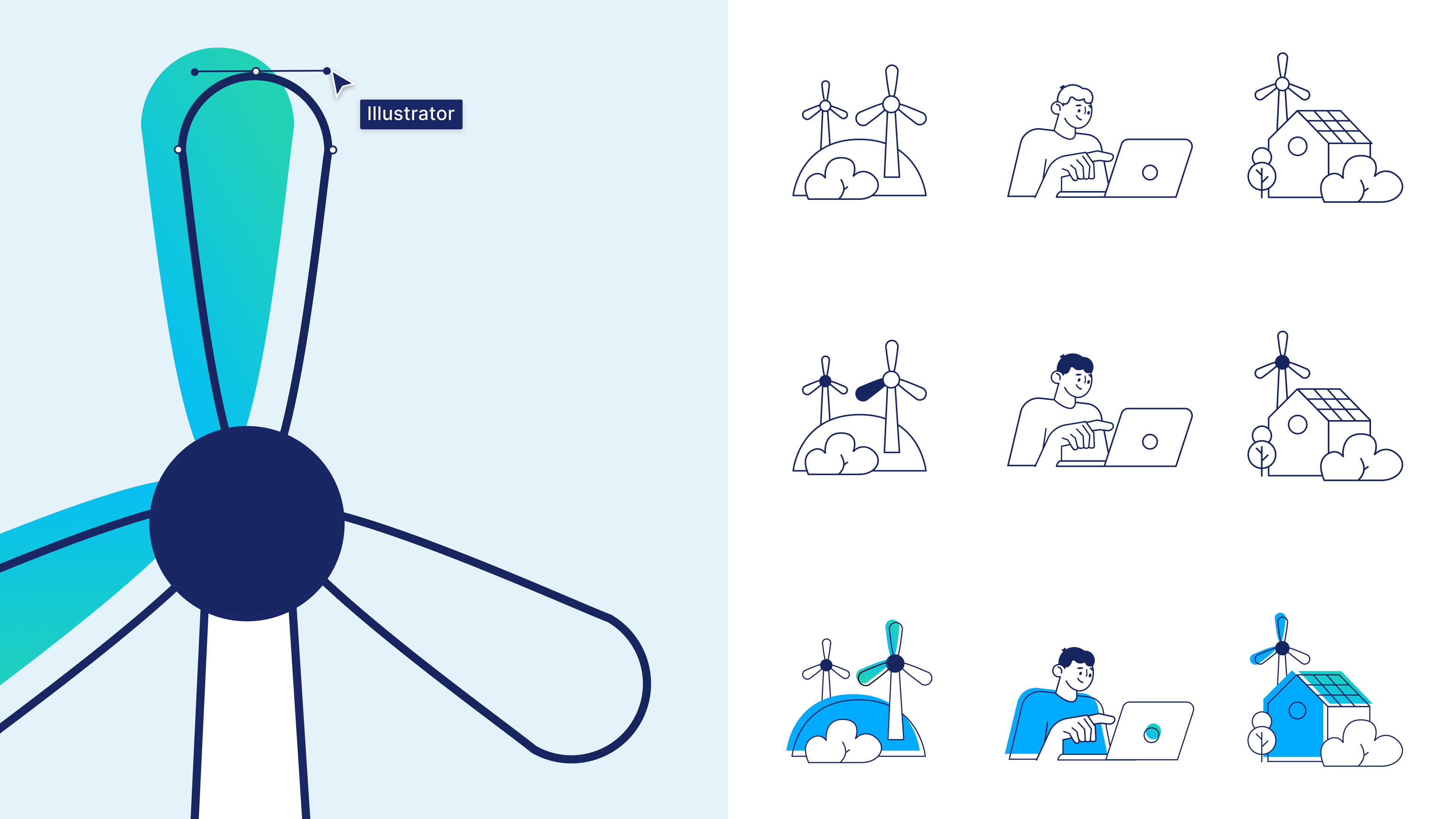
Inheriting offset strokes and fills from ENGIE's global icon style, the illustration library is vast and functional. We incorporated Figma functionality within our illustrations, using components and variables to assist our character creation which both increased the variety and maintained consistency across the suite. Particular thought was given to building out a diverse set of illustrations that reflected the diversity of our local Australian landscape.
“We are thrilled to introduce our latest digital customer experience, marking a significant milestone in our transition to ENGIE...
This represents our evolution as a brand that is committed to accelerating the energy transition, as well as delivering exceptional outcomes for all who engage with us.”
- Penny Maher, General Manager Marketing & Digital Experience of ENGIE Retail
